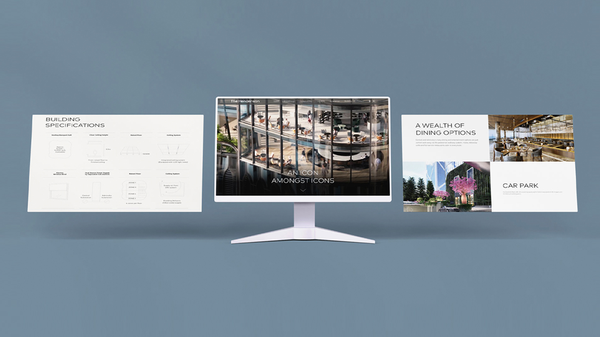
The Henderson Website Design
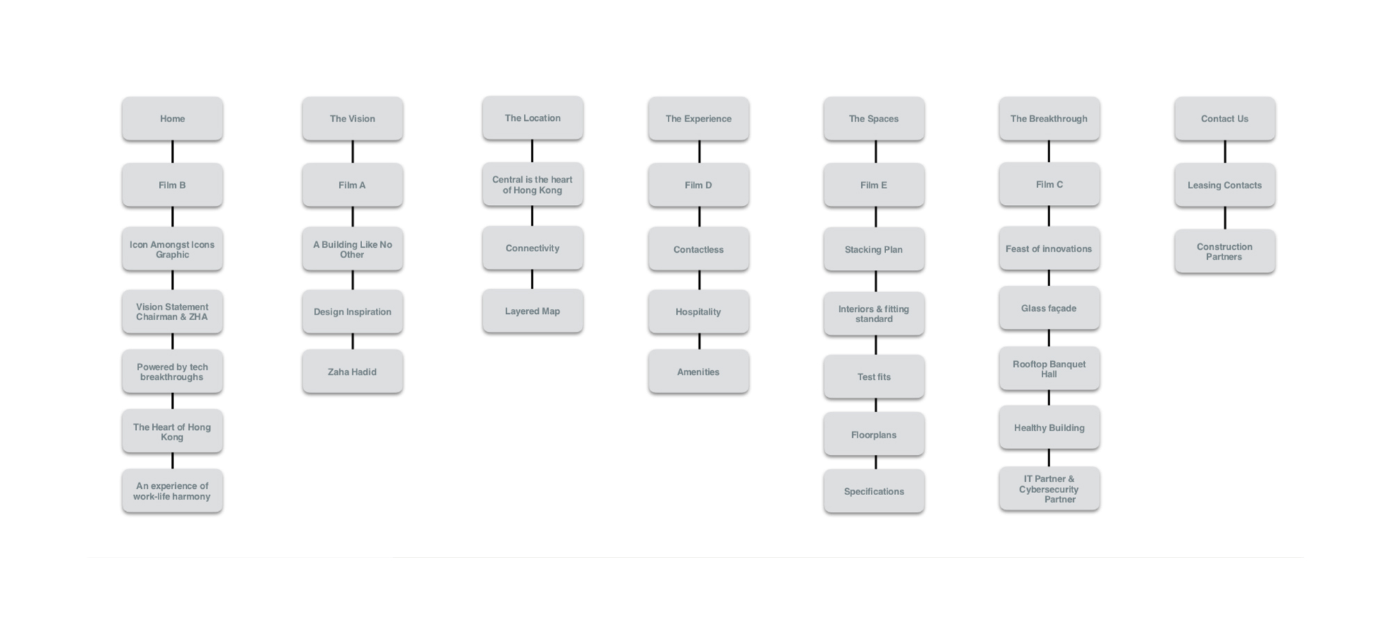
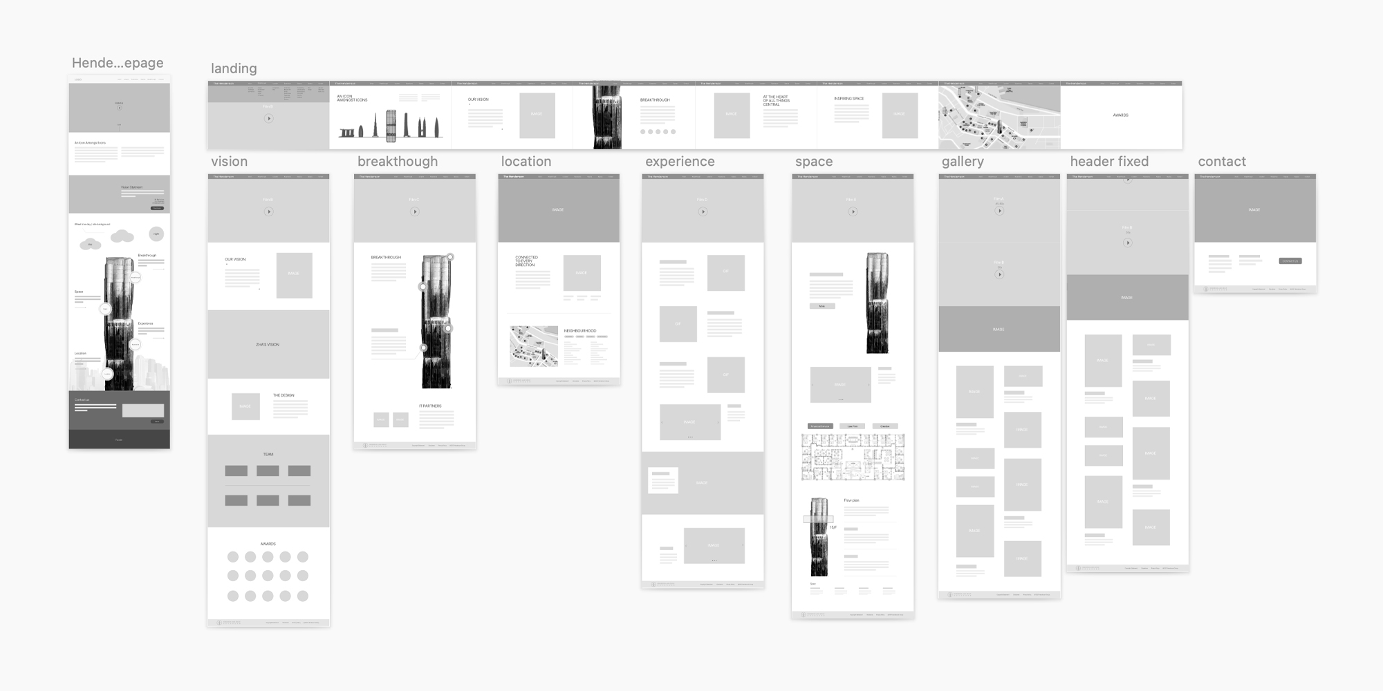
sitemap.
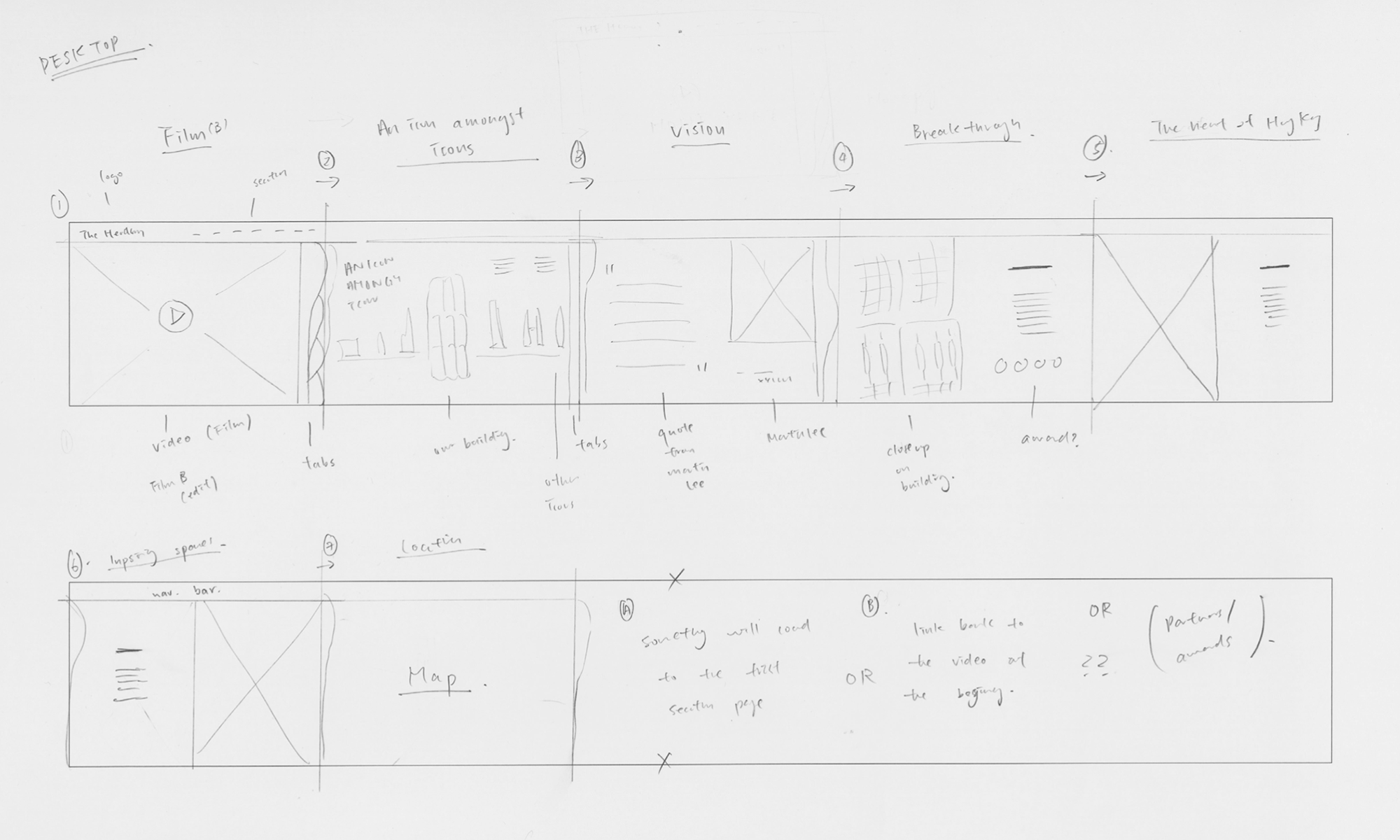
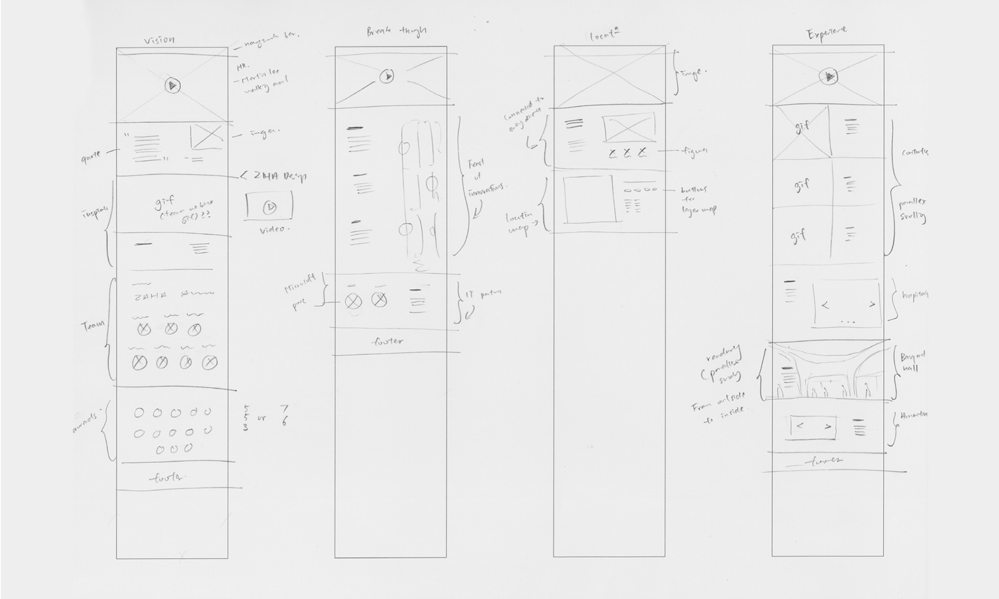
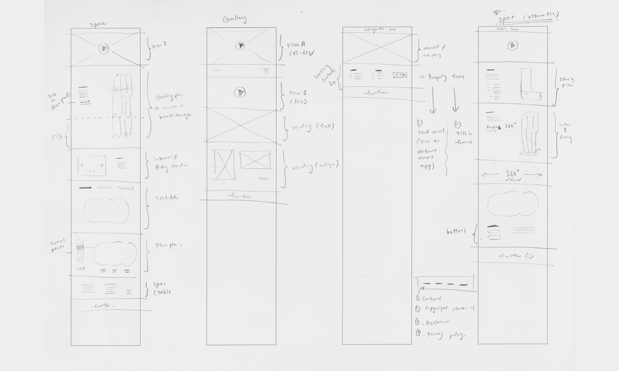
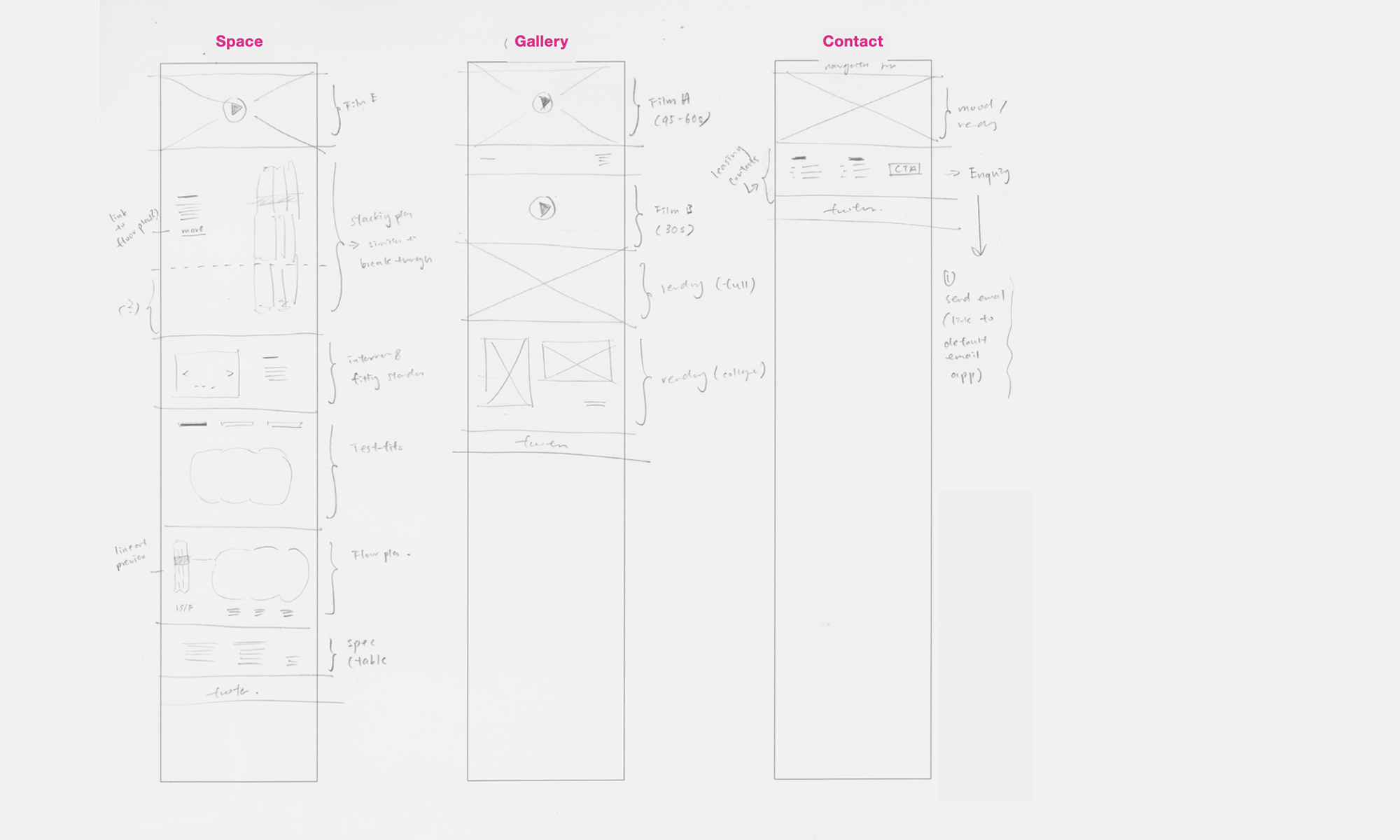
key sketch & wireframe.
Our team was tasked with confirming the basic information and structure of the site, and since it was designed to provide information and metadata about a building, we considered the use of infographics to showcase the architecture. We also anticipated potential complications with motion and responsiveness during development.
ui design & prototype.
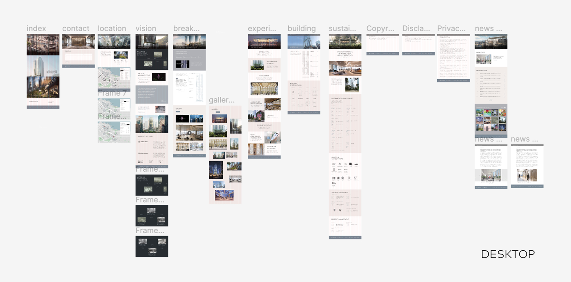
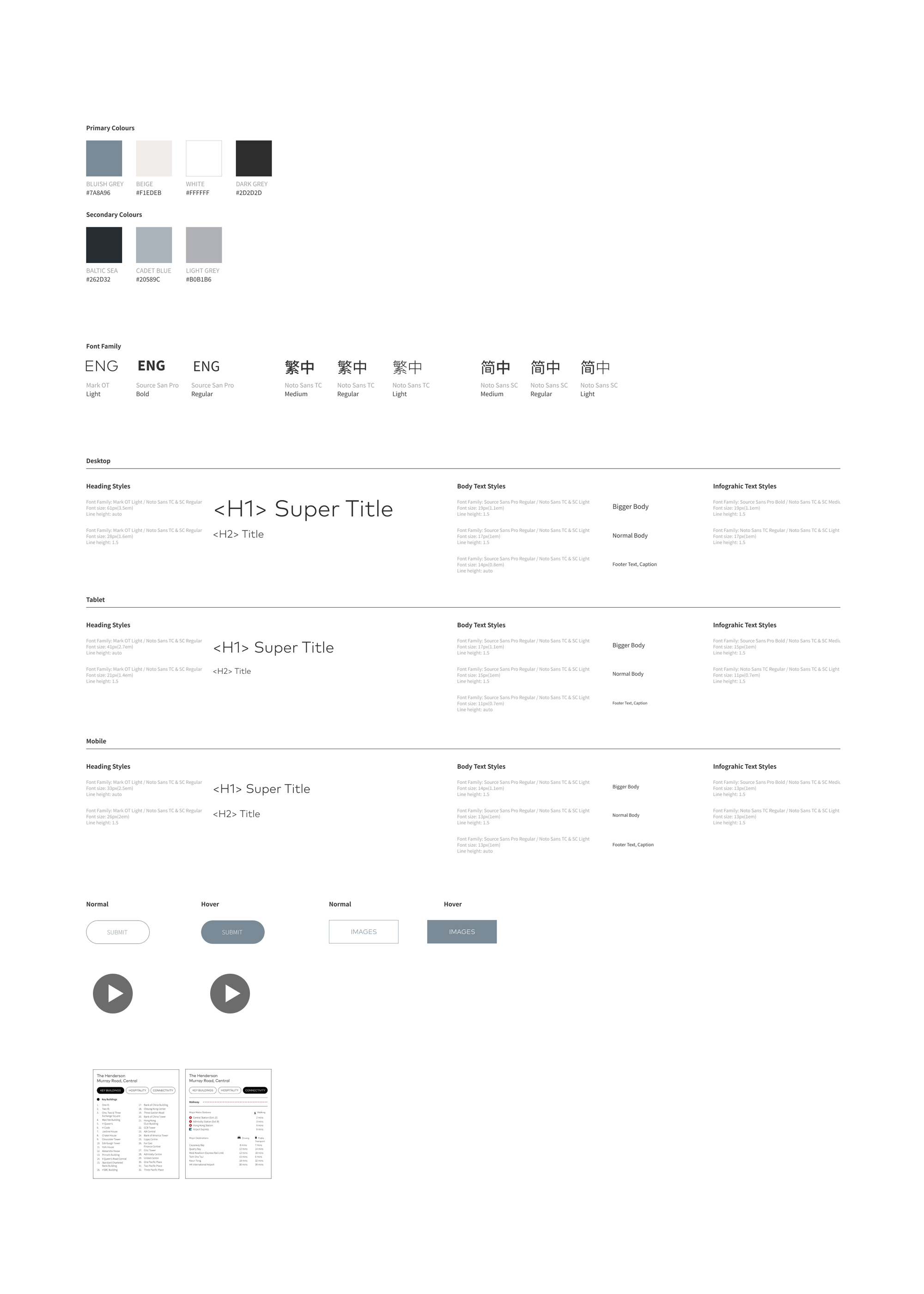
Our branding partner, Eight Partnership, determines the colour palette and font style for the project. However, my team is responsible for designing other elements, such as typography. This collaborative approach ensures that the branding is consistent across all materials and the final product meets the client's expectations.
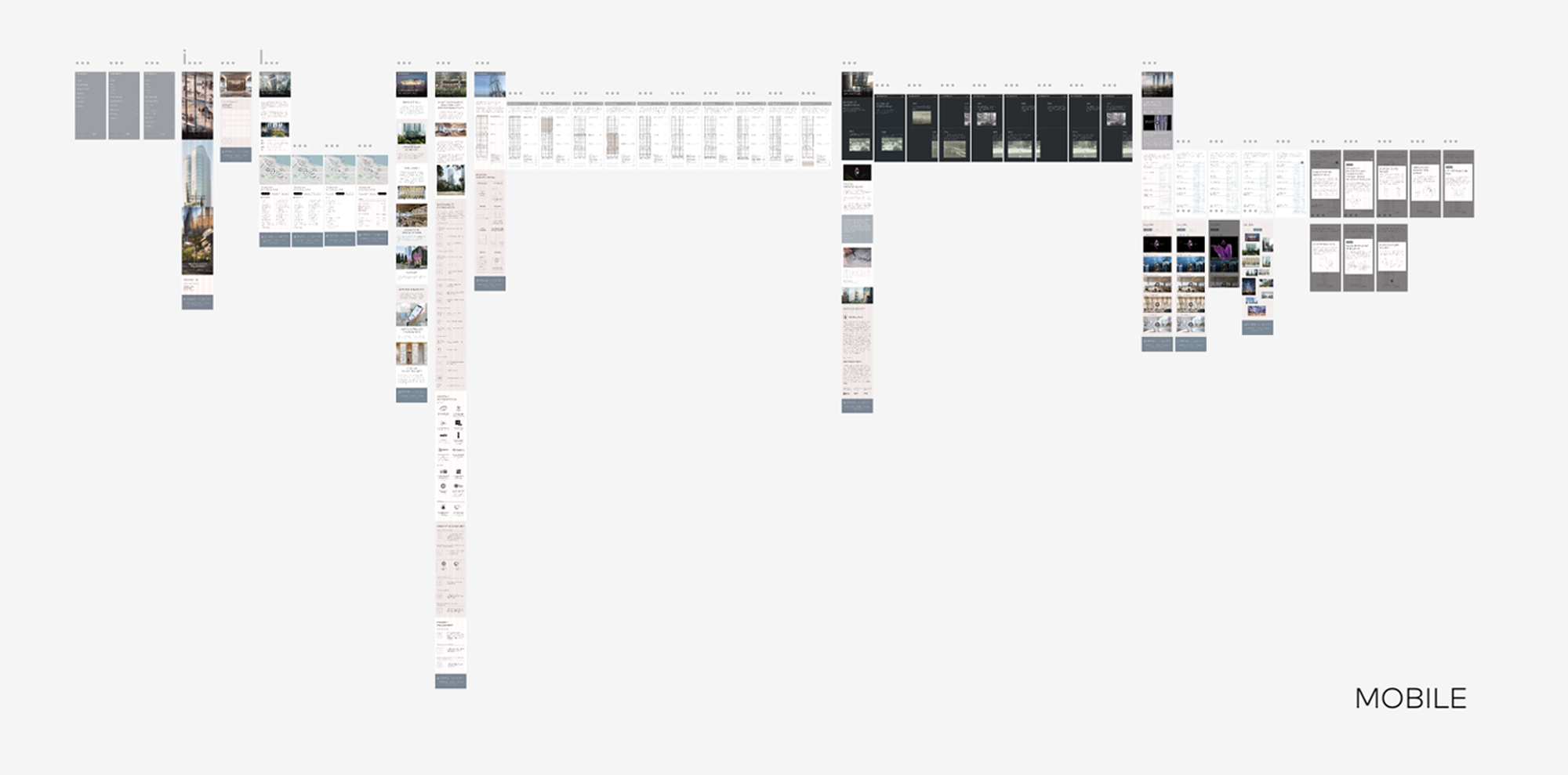
To ensure a seamless user experience across all devices, we set the browser cut-off of the tablet version at a width of approximately 767 pixels and around 479 pixels for the mobile version. However, due to the complexity of the infographics, we made some special adjustments for particular browser sizes to maintain the consistency and clarity of the information presented. Our goal was to create a responsive interface that allowed for easy navigation and readability on all devices.
To ensure a seamless user experience across all devices, we set the browser cut-off of the tablet version at a width of approximately 767 pixels and around 479 pixels for the mobile version. However, due to the complexity of the infographics, we made some special adjustments for particular browser sizes to maintain the consistency and clarity of the information presented. Our goal was to create a responsive interface that allowed for easy navigation and readability on all devices.
output.